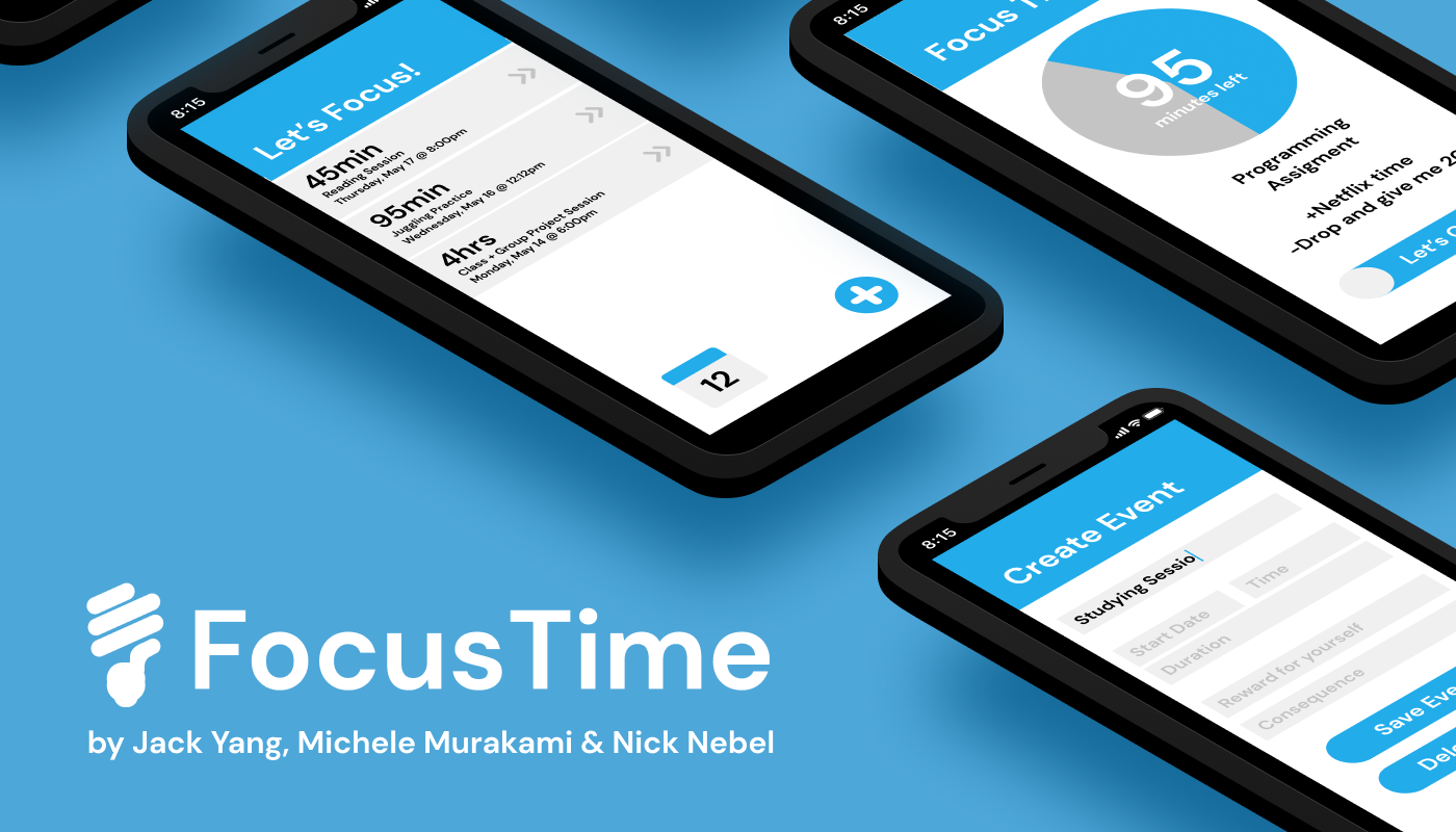
Focus Time
Design and Web Development Project
UC San Diego (COGS 120: Interaction Design)
Background
In our day and age, mobile phones are ubiquitous. They let us communicate, learn, and interact with the world at large at all times of the day, no matter the place. At the same time, however, they are a great source of distraction. Texts, push notifications, and social media apps threaten to take our attention away at any second.
And that’s not to say we don’t do our best to handle it. Given how convenient it is to get completely sidetracked on our phones, we make a good effort—plotting out times in our schedule get things done. Yet, the best laid plans are ultimately still fallible to human errors, it’s only natural.
To convert our best efforts into better outcomes, what students really need is that extra step, something to hold them to their own promises.
Students should have a way to keep track of their work time, and establish their own incentives the way they know best.
Examining the Problem
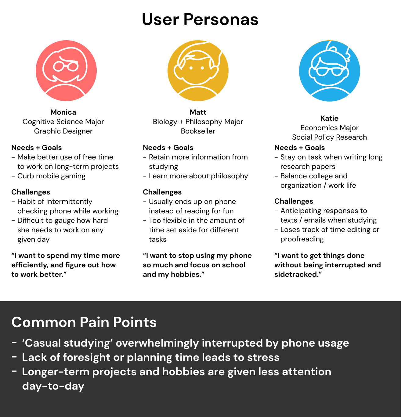
As a team, we decided to research the roots of the problem where it was most prevalent—with students at UC San Diego’s own campus. We reached out to several students to ask for their experiences when it came to smartphones and studying.
Competitive Analysis
In our attempts to create a new time management and productivity app, we considered what worked and what didn’t when it came to preexisting apps out there.
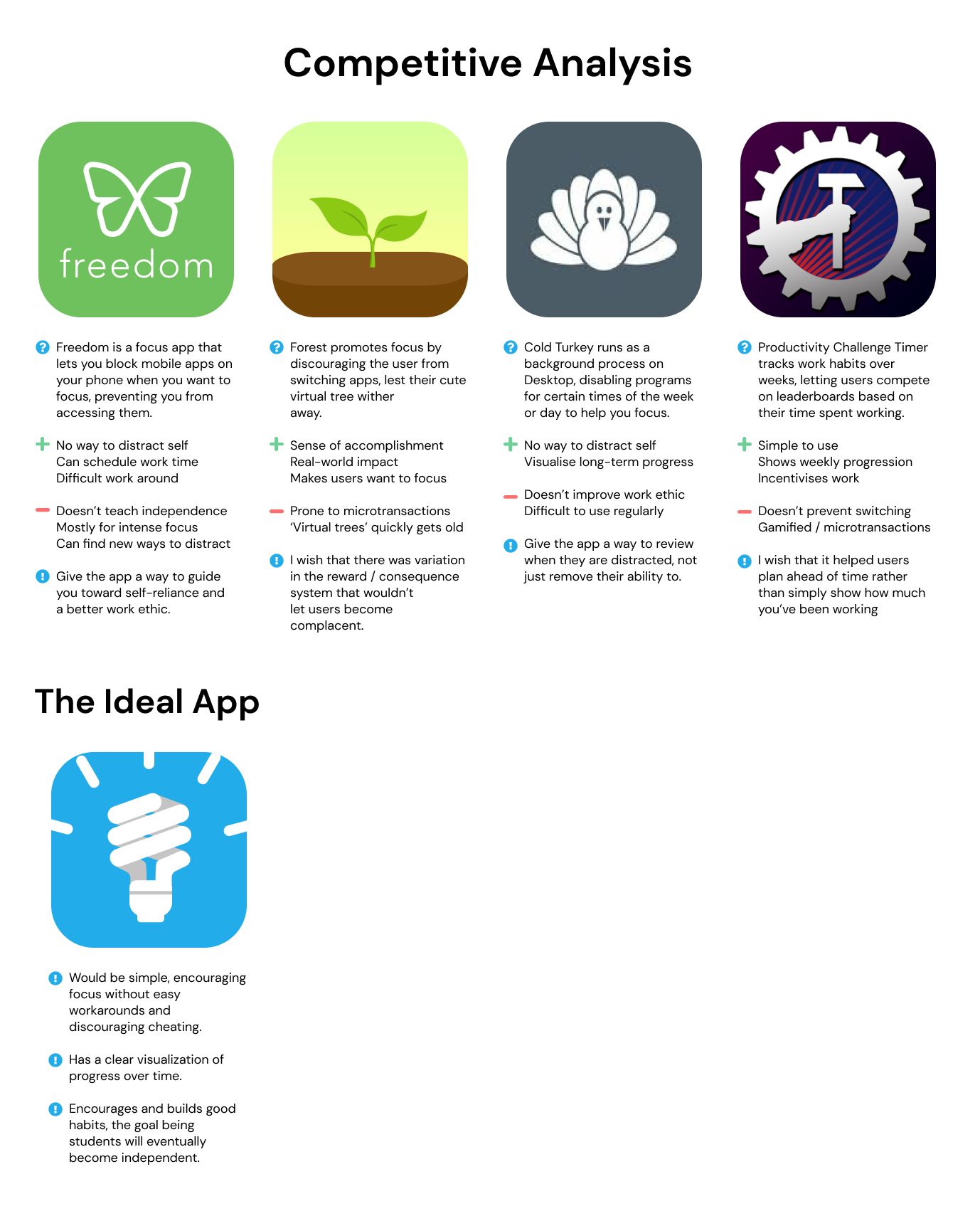
Combined with the inclusion of micro-transactions, these focus apps become just what they market themselves as—a game. We wanted to avoid this as much as possible, and decided to on instead focus on these factors after our competitive analysis:
- Keeping the interface and concept simple
- Eliminate potential work-arounds and gamification
- Encouraging good habits over time
- Reviewing one’s progress
Prototyping
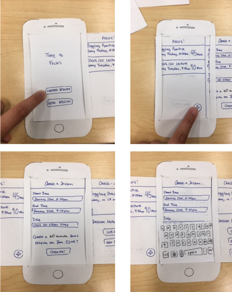
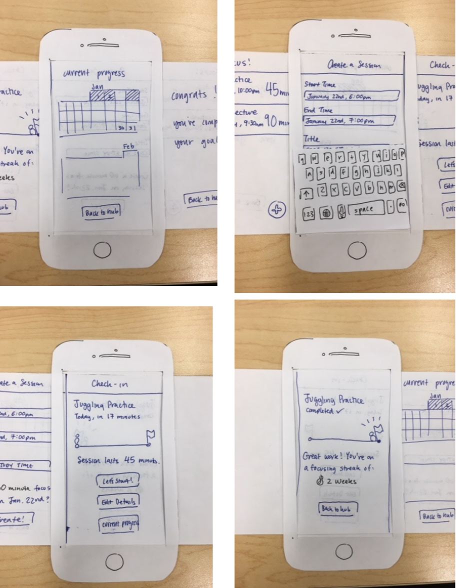
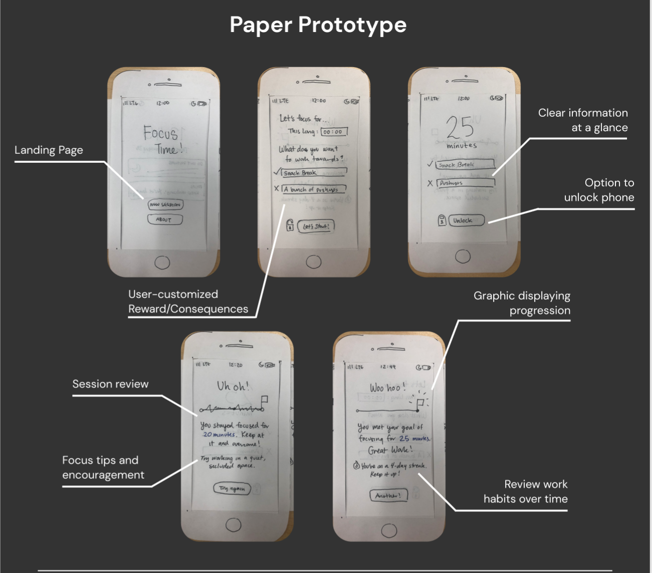
Paper Prototype
To fully map out the experience of our proposed app we set about creating paper prototypes, thinking back on what we liked about the existing productivity apps (simplicity, visualization of the long-term) in our competitive analysis. We decided on trying to make prototypes based on two sets of features:
- Emphasis on finishing task in the moment or during the day of
- Simple interface and timer, custom system for rewards and consequences
- Minor reminder of progress over small time scale in a streak system
- Emphasis on improving ability to focus over time
- Calendar for tracking session dates and success/failures over a month
- All scheduled events visible from a glance from a home page
Testing + Results
To test the prototype, we asked subjects about the type of goals they wanted to work on. We then showed them the prototype, allowing them to experiment
with creating events and checking their progress. While we didn't have the time to observe them focusing on all the events they created, the general opinion
after a few minutes of usage was that being able to see the sessions at a glance was helpful.
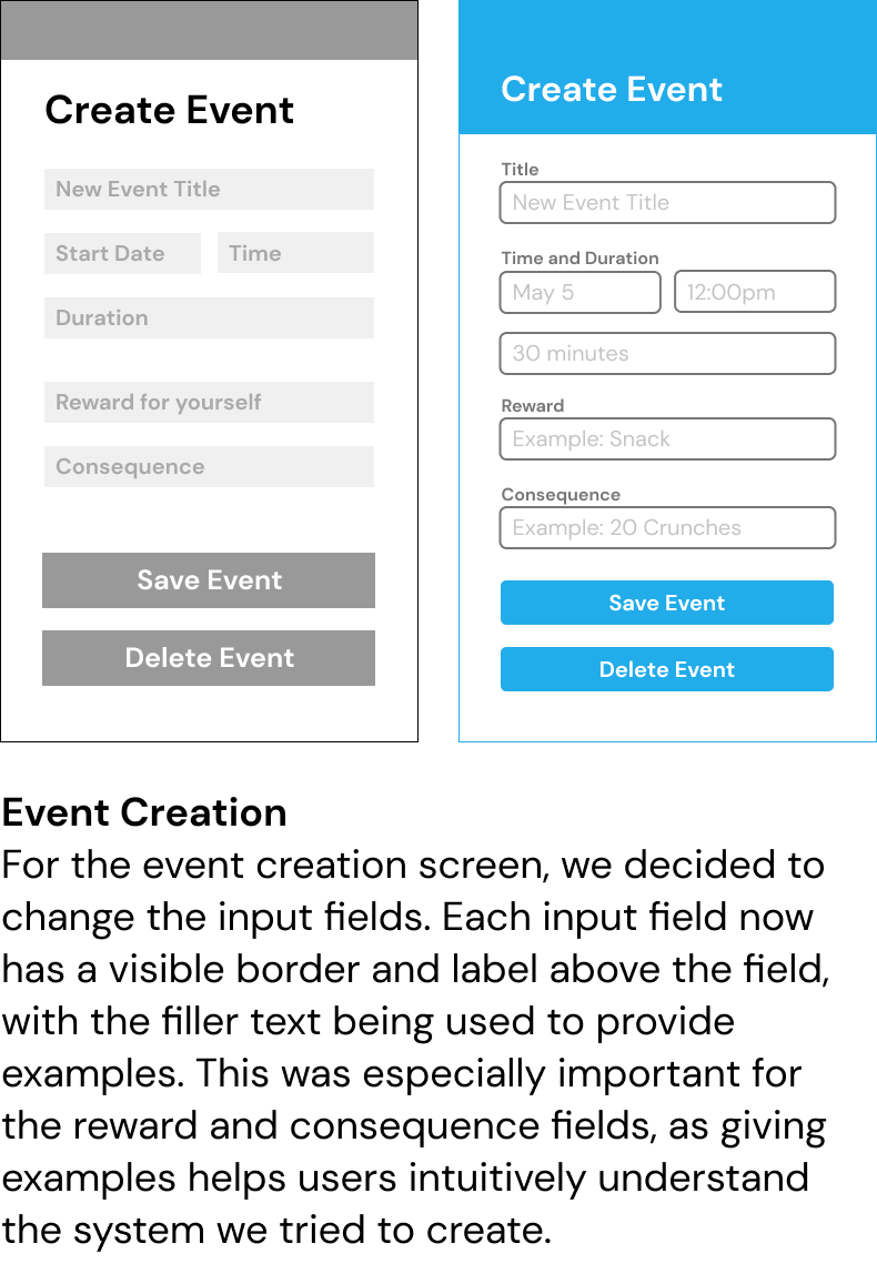
Alongside the praises there were also some criticisms about the interface. For one, the system of custom rewards and consequences was not intuitive for users, who
were somewhat unsure of the concept. Additionally, cases where users might want to delete or edit event details were not addressed by our prototype. Following the testing
period we came up with some ways to remedy the users' issues:
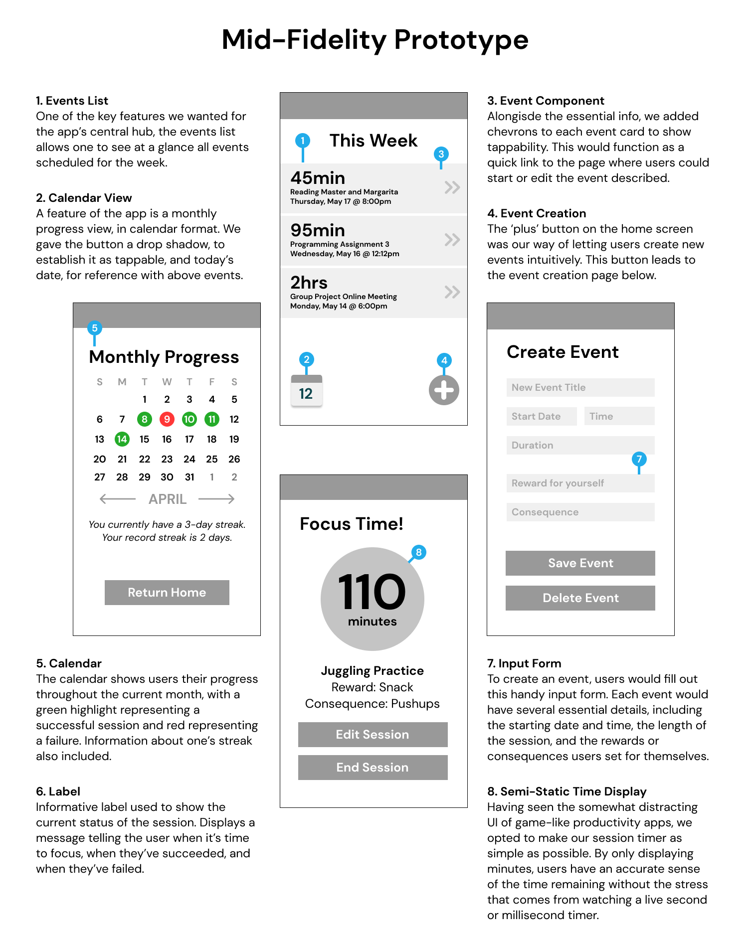
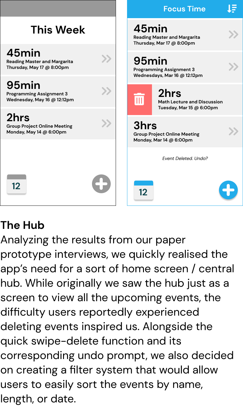
- Allow users to delete or edit event details
- Have a central hub displaying all events created
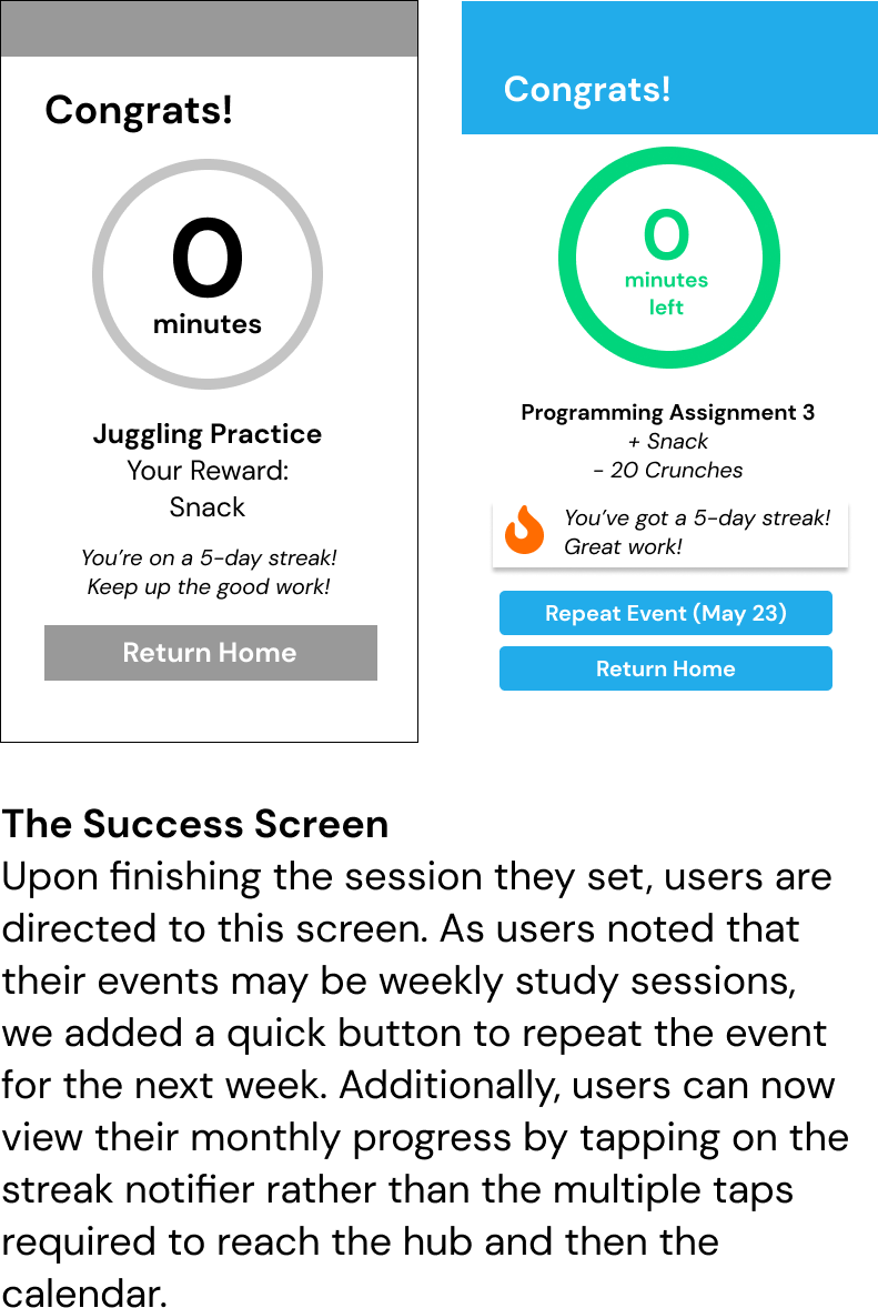
- Put streak info to encourage users after completing/failing event
- Create calendar to track monthly progress
Mid-Fi Prototype
We sought to reflect these remedies as we created our digital prototype. Below is a detailed explanation of our app's features, and descriptions of our attempts to make the app intuitive.
Figma Frames
Final Design
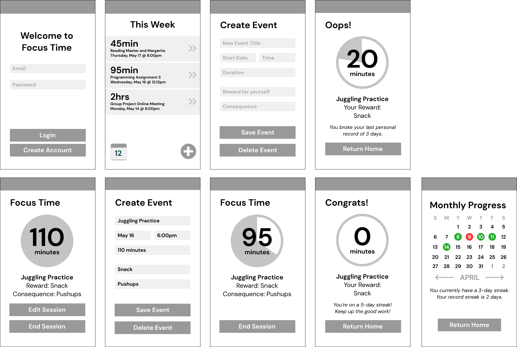
Changes from Mid-Fi
Using the remainder of the 10-week course, we finished designing our project. From a round of testing on our mid-fi prototype, we discovered more issues with the design and flow of the app. Here are a few changes we made in response:
Final Frames
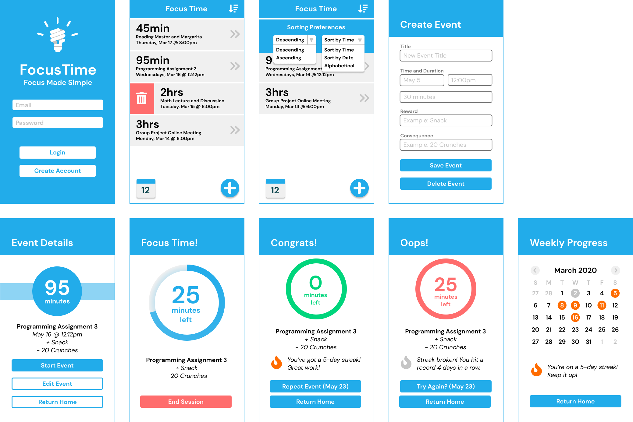
Using Figma, we were able to link our design frames into a working prototype for our in-class demonstration. The interactive prototype can be viewed below, as well as at this video link.
Reflection
Though we were only given 10 weeks in the Interaction Design class to complete this project, I decided to revisit it the following quarter. Born from interactions and conversations I had with other UCSD students about work ethic and mental health, it was a project that I thought was important enough to see to completion.
As one of my first real, collaborative design projects, I’d say this was a great learning experience. If I were to revisit this project, I would but a greater emphasis on reaching out and researching users in a wider community. As my team was all on campus at UCSD, many of the subjects we interviewed and tested our product on were UCSD students. While our original idea had college students in mind I can see many others in both the professional world and high or middle school struggling with the same sense of self-discipline that I originally sought to help tackle.
Back to Portfolio